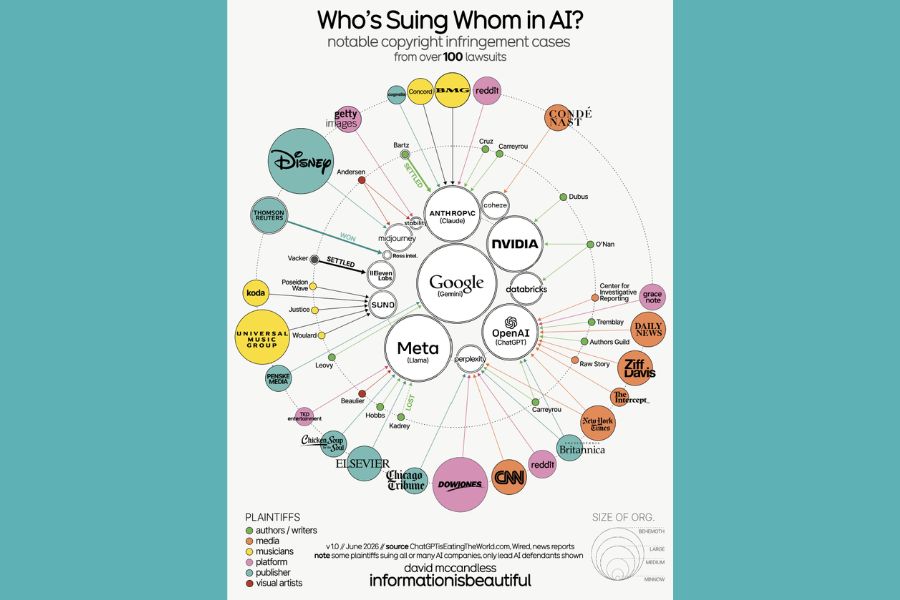
Seeing information visualized is one of my favorite types of media. In the past I’ve also recommended the Information Is Beautiful site as one to add to your reading list. They do beautiful work. This week, I did come across a recent visual which showed the limitations of their craft. The chart, which focused on the question of who is suing whom in AI includes lots of arrows pointing between companies. The problem is that this question has become one of the most meaningless in America for several reasons.
First of all, anyone can sue anyone regardless of merit. This leads to lots of lawsuits that have no resemblance to the actual reality of a situation. Sadly, much of this meritless litigation ends with some sort of settlement as one party decides that the truth is too much trouble to fight for, and it’s easier to just pay for the issue to disappear. This is the second problem because it obscures the issue and detaches the truth from the victor. It’s a system that routinely allows the bad guys to win.
Finally, tracking the lawsuits themselves can effectively bury the real story that deserves more attention through the gag orders and NDAs that prevent the truth from ever emerging. If you have a solution for this, I’d love to hear it. Until then, I’ll probably retain my skepticism for any stories that emerge about lawsuits in the future too.