I’m going to break one of my own rules today. Usually, my philosophy for sharing marketing insights is to always use a positive tone. Even when a strategy is executed poorly, I would rather focus on missed opportunities than write about the negative. That usually works for me … but not this time.
What doesn’t work is when a brand is proudly bad. Successful brands don’t offer their customers bad experiences and pretend they are great.
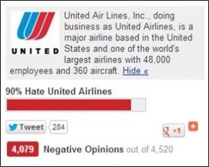 Unfortunately, that is exactly what United Airlines has done over the past year with routine promotions for their website. Despite offering one of the consistently worst user experiences of any website in the travel industry, United continues to promote it. While I’m hardly the first to point out the usability flaws, what IS amazing is that it has been nearly a year later and the site shows no signs of any improvement.
It is one thing offer a poor experience and be working hard to fix it. That anyone could understand. It’s quite another to put a bad experience in front of your customers, make no effort to fix it (after a full year), and create marketing messages to promote it.
Over the past year, I have often traveled on Delta Airlines as well – and the difference between their recently redesigned easy to use site and United’s is like night and day. While United was taking a giant leap backward last year by abandoning their own site to adopt the Continental Airlines website after their merger, Delta has spent the last few years investing in creating a great online experience.
Luckily, there is good news in this story. Looking at United vs. Delta may present the ultimate case study in contrasts for how to successfully implement a great user interface, and how NOT to – in a way which should offer lessons for any industry. So below are some concrete examples of what any brand that aspires to build a great user interface can learn from United’s missteps, and Delta’s strengths.
What United Gets Wrong …
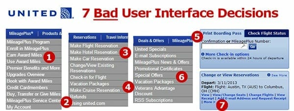
- Confusing Lingo. At one point, the menu says “Use Award Miles” and a few options later, it says “Book with Award Miles.” And neither option is actually under the “Reservations” tab, where most users would actually expect to find an option for booking a new flight, even if they happen to be using miles.
- No Hierarchy. All the menu options seem to be randomly assorted across all the tabs – with no system of order. For example, “My Account” is buried at the bottom of the MileagePlus section, even though many users who click on that area are most likely trying to navigate to their own account.
- Redundant Options. Under “Reservations,” every type of reservation from flights to hotels to car rentals are each presented in a separate drop down menu. Not only does this make the menu needlessly longer, but it is also the perfect example of United putting its own priorities ahead of its customers. Clearly booking hotels and car rentals bring more commission dollars back to United, but why offer so many confusing options when the vast majority of customers are probably wanting to start by booking a flight?
- Discouraging Browsing. When the average traveler is planning a holiday, it is the ultimate browsing scenario. They want to see the possibilities They want to dream about where they might go and how they might get there. And, of course, they want to get a sense for how much it might cost them and how easy it is to actually get there from where they live. United makes none of this simple and instead forces potential vacationers to even choose right away from whether they want to book a Vacation Package or reserve a Cruise.
- Complicating Simple Tasks. The online Check-in for flights is increasingly one of the most common things that travelers are doing before heading to the airport. United, like many other airlines, offers the functionality to print a boarding pass or download a mobile version that can be scanned at the airport. The check-in feature on the homepage, however, says simply “Print Boarding Pass” – which makes it a confusing option for people who might want to Check-in, but not necessary print their boarding pass. In addition, the Check-in feature frustratingly always requires you to put your confirmation number in – even though you are already logged in.
- Separating Related Information. There are at least four different menu options that allow travelers to see current special offers and deals from United. You can get Vacation offers, special offers, and United specials – which are all delivered on different pages. The result is a scavenger hunt for offers that would make even the biggest coupon collector give up in frustration.
- Not Remembering User Profiles. If you are logged in on the homepage, you can see your upcoming flight – but there is no easy option to check in or requesting an upgrade. Want to check in? This lack of personalization, unfortunately, continues to the check in experience – where despite being logged in you will ALWAYS be asked whether or not you are “13 years or younger.” Why ask for a birth date if you will immediately forget this information when someone is checking in?
What Delta Gets Right …
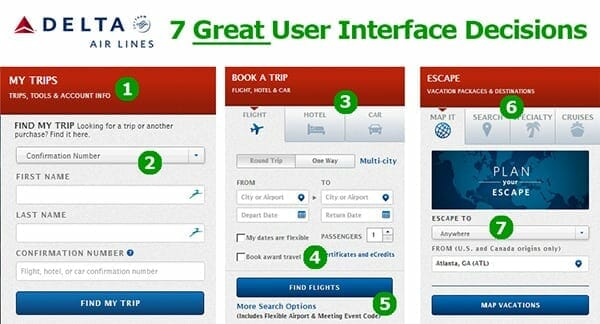
- Smart Aggregation. The most common task of finding or managing a reservation is easy to find, and appropriately labeled under the broad tab of “My Trips.” In addition, when you are logged in, this area becomes customized to show your current mileage earning in a visual chart, as well as your current number of points.
- Dropdown Navigation. While United may not believe the dropdown menu is a great way of presenting multiple options – Delta uses it effectively to let you search for your reservation with multiple parameters.
- Visual Highlights. The reservations area of the site uses visual cues to illustrate what type of booking you are making, and defaults to airline bookings (which as the most likely thing you’d do on Delta’s site). These visual cues provide a reminder for users that they can organize all their travel directly on Delta without creating confusion or getting in the way of your booking a flight.
- Reassure Users. One of the most common things to happen in the travel industry is some sort of delay or overbooking that leads to certificates or discounts for travelers. Rather than going through a booking process only to find you’re in the wrong place, Delta reassures travelers who want to use one of these certificates right away that they are using the right tool for that.
- More What? Rather than using the ubiquitous “Click here for more options” button, Delta gives you a few examples of what “more” really means. This little bit of knowledge helps users figure out if clicking that button may actually lead where they want it to – and aids in the usability overall.
- (and #7) Encourage Dreaming. Every travel site wants to sell vacation packages, but Delta calls their section “Escape” and gives you plenty of ways that you can start to think about the types of trips you might take. Even the drop down menu starts with the default option of “Anywhere.” The end result of this creative use of language is that the traveler is encouraged to dream about (and browse for) vacation destinations. By treating vacation as something more emotional than just a transaction, Delta makes it more likely you will spend time on their site planning your next vacation.
As a consultant who has worked with many web teams, there is an ultimate irony in this post that I should end with.
United already knows about every problem on its site.
My guess is that more than one person within the team at United responsible for this site has already made the case to fix every problem I outlined above. And they have either been denied budget or resources by managers within United who don’t “get it.”
So, let me end this post with a simple plea to those managers at United: Your web experts are right. Your site is awful – and your customers know it (and not just the tech savvy ones like me). Immediately invest in your user experience and follow the advice that you have most likely already heard.
And in the meantime, you may want to ask the marketing team to stop promoting the site until it actually offers the experience you are already promising.












You have focused on aesthetics. My complaint is functionality. Pre-3/3/12, I could purchase a ticket on united.com and it would actually be confirmed in real time, now confirmation is it is delayed. The website is really slow, and is error ridden. I have been presented with the price in non-US currency for a domestic US flight twice in the last week. I get a browser warning about non-secure connection when purchasing tickets, and many more. It’s a disgrace.
Great point – I haven’t seen that problem, but I have had the delayed confirmation problem. Functionality is certainly more important, but bad usability gets in the way … often to the point where users aren’t able to complete tasks whether the functionality happens to be there or not.
Delayed ticketing is a problem with their reservation system, which also needs improvement/replacement. However, replacing that system is a whole other can of worms.
Great article until the end. You’re assuming they have had good internal advise. Truth is, CO fired almost all the influential UA executives when they took over. Most likely, anyone who “gets it” was fired a long time ago. This pathetically weak executive team cannot face dissent so they eliminate it, allowing themselves to feel superior without distraction.
You might be right – I don’t know the internal politics there … but in my experience usually there are those smart folks within most organizations who know the right thing to do, but they lack the influence or authority to do it.
This is fabulous. Unabashed honesty about what doesn’t work in UI. Are you taking suggestions on other interfaces to dissect? Some tech companies are equally guilty.
I love the case study comparing the good vs. poor user experience. Thank you.
Rohit – Love this article. I had an experience earlier this year when United prompted me for the “up-sell” to purchase Economy Plus. The problem is that I had a paid first-class ticket You can now buy “premier status” for $8 a flight – I’m sure it makes those who qualify for the status really happy that a one-time flier can get the same status for $8. The list goes on and on. @United
Mobile usability is key for airline websites, especially for the check-in function, so thanks for highlighting Delta’s intelligent content aggregation. It’s obvious that Delta has done its user research.
Cheers
Sarah Bauer
Navigator Multimedia
You lose credibility on two points:
1. Delta.com is not an example of what a travel site should be. The refresh made a shaky site even less functional for tasks like booking a flight or finding an award seat. Your point would carry more weight if Southwest.com were your example. That is a truly intuitive, functional site.
2. Your own site is guilty of cardinal design sins, especially given your agency background. 3 sentence headlines?!?
Sorry, but United.com does very well at two things – booking a flight and finding an award seat. It’s not pretty, and needs improvement, but it should not be a form over function refresh like Delta’s. That design lost functionality in the process.
Hi Brian,
Thanks for your comment. Actually, I have used Delta’s site for both booking flights AND award seats and both experiences have been very easy to do. United’s site is difficult for both. Just a small example – when you use United’s site to search for seats, and then want to search for another date, the form to start over is hidden at the bottom of the page. I think your main complaint comes from having been used to the old Delta site and now being forced to adjust to something new. I agree that can be frustrating – because you already figured out how to use the old system and now you need to change. And your point about Southwest being superior is probably right – I didn’t choose them simply because I hadn’t used their site recently to book a flight and I HAD used both United and Delta. As for my own site – it is not an ecommerce site and doesn’t have the same goals in mind, so I’m not sure your comment about a headline extending across 3 lines (while not optimal) makes sense to use as an example of how usability or functionality could be improved.