 Myspace is back, and you’re probably already thinking about the best jokes you can share about its return. It’s hard to remember a brand launched with such dramatically low expectations as MySpace – but if my first experience using the new site is any indication, the new Myspace may be more important for brand marketers in 2013 than you think. While it is tempting to just dismiss any new social network as unworthy of attention, the “Borg-like hive-queen” vision of Google Plus and its slow rising popularity show that there is plenty of room in the social networking world for more forms and destinations for expression – as long as they offer something unique.
To be fair, Myspace doesn’t quite meet this criteria, because the functionality of the site is still limited and you’re not yet able to add all your friends and promote brands. Still, after my early review there are plenty of reasons for marketers to get excited about the potential for the new Myspace and pay attention to the site as it launches in 2013.
1. Horizontal Navigation
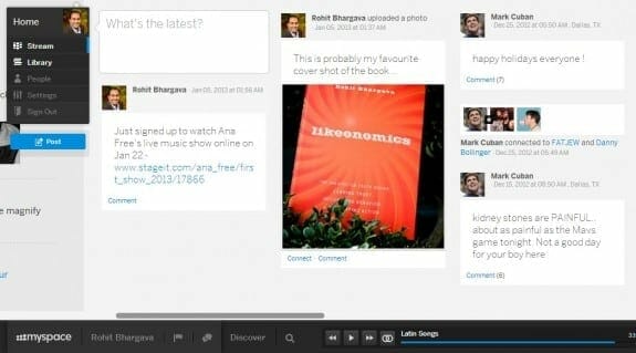
Probably the one user interface feature I was quite excited about is how people’s profiles unfold from left to right, and scroll horizontally. Given the way that we read books, and the fact that most of the screens we use on a computer are horizontally oriented, it is one of those rare design ideas that makes so much sense, you wonder why no other large site has chosen this navigation style. As more consumers get used to this style, it opens up more possibilities for brands to use the same design in powering new ideas for engagement online.
2. Power of Visual Search
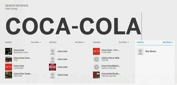
When you search for an artist or a person, the search box takes over the entire screen with your search query presented in a satisfyingly large font. More importantly, searching for a brand not only provides relevant people AND songs, but gives a uniquely complete social portrait of a brand in terms of entertainment. In the future, I could see this becoming a sort of visual pop culture search for brands … want to see songs that mention Hennessy Cognac, or Coca-Cola? Myspace can do it.
3. “Hidden Side” User Data
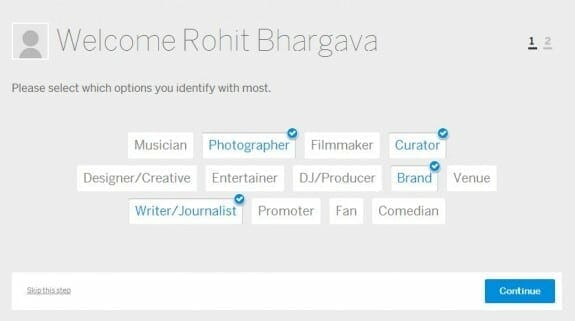
Right from the first moment of registering, Myspace asks a unique set of questions to help people describe themselves. As I went through the registration process, everything from that first choice to also selecting a unique song to relay my personality and beliefs (I chose “Half the World” from Rush) were the sorts of questions I hadn’t been asked before, or ever posted online. Right now, I have a unique mix of a few of my favourite Latin songs (see image below), and shared a virtual concert I’ll be attending for the talented Ana Free. If other users end up sharing more unique data about themselves and preferences that is not duplicated anywhere else, it will become an opportunity for the right brands to engage people based on interests they have only really declared in one place online … in Myspace.
4. Expression-Centric Interface
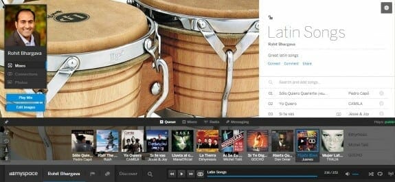
The entire interface of Myspace seems designed around entertainment and music in particular. This is great news for anyone who is an entertainer or “talent” to showcase all their creations. It’s also a great model for anyone who wants to present more of their creative and artistic side. On my own profile, for example, I used a background image of a recent photo that I took on my family trip to India a few months ago. Before sharing it there, I hadn’t really posted it online anywhere. The brilliance of putting expression front and center is clearly tapping into the trend of social visualization, which I wrote about last month.
5. Interactive Brand Promotion
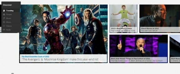
With high profile celebrities like Justin Timberlake behind the resurgence of Myspace, one of the marketing tactics we will likely see in the coming months is more actors, musicians, artists and other expressive celebrities turning to Myspace as a new way to share their creative work. For brands working with these spokespeople, this presents a wonderful short term opportunity to provide content for this new platform and stand out like a big fish in a small pond. As Myspace remains in early “open beta” phase and continues to grow, the brands that move earliest along with their spokesperson partners will have a chance to stand out, and get more engagement as well as media attention for being early adopters.











This site is
truly amazing my one of friend told me about this. And the theme is quite
beautiful as well as the updated stuff also attract visitors to come and visit again. I would definitely
bookmark it and would come back to you soon. Keep on updating.
Mobile Help
Forum